


Using colors is a great way to communicate visual information as it can affect how we feel, behave, and think. That’s why designers of products should use the basics of color theory when choosing colors. Some people think that designers pick colors they like, but the process is more complicated and important in design.
Colors can strongly affect how we feel and act, and picking the right colors is crucial for a product to succeed. Research has found that people form instinctive opinions about a product in just 90 seconds, and between 62% to 90% of that decision is influenced by color alone. So, by choosing the appropriate colors, we can make a product easier to use and increase the chances of people buying it.
What Graphic Design is?
Graphic design is the process of creating visual materials that meet the needs of users, using the basics of color theory to convey specific messages, or solve problems. It utilizes the basics of color theory to be as clear as possible. This is achieved by using methods like choosing colors, selecting fonts, and using images to communicate information effectively and provide an enjoyable user experience.
What Color Theory is?
Designers use the study of color theory, which is a set of rules and suggestions, to create attractive color combinations in interfaces that communicate with users. To consistently choose the best colors, designers use a color wheel and draw on their knowledge of how humans perceive color, psychological and cultural factors, and other relevant information.
What are the Basics of Color Theory?
To create a beautiful design, it’s important to understand the basics of color theory. Even if your design looks great, using the wrong colors or colors that don’t go well together can make people lose interest quickly. So, knowing how different colors work together is crucial for making a beautiful color scheme.
Graphic designers use color theory to figure out which colors complement each other. Color theory is the study of how colors are utilized in the design, including color palettes. In traditional color schemes, designers use different variations of each color by adding black to darken it, gray to mute it, or white to lighten it. There are various kinds of traditional color schemes available.
- Monochromatic: Different shades, tones, and tints of a single color or hue.
- Analogous: Three colors located next to each other on the color wheel, with the main color being in the middle.
- Complementary: Two colors located opposite each other on the color wheel.
- Split complementary: A primary color paired with colors analogous to its complementary color.
- Triadic: Three colors spaced evenly around the color wheel.
- Tetradic: Two adjacent colors on the color wheel paired with their complementary colors.
- Square: Four colors spaced evenly around the color wheel.
To make a good design and use colors to their best advantage, it’s important to know how colors are made and how they interact. That’s why students who study art in schools, colleges, and universities learn about color theory, which is all about the characteristics of different colors. In this article, we’ll go over the fundamental concepts of color theory for graphic design, which include the color wheel, color schemes, and the way colors affect our feelings and behavior.
- Color Models CMYK and RGB
Before getting into the color wheel and color schemes, it’s crucial to comprehend the two primary color systems employed in graphic design: CMYK and RGB. CMYK is a subtractive color system utilized in printing. It stands for Cyan, Magenta, Yellow, and Key (black). In this system, colors are formed by layering these four inks in different combinations to create various colors. The more ink you apply, the darker the color gets. CMYK is frequently used in printing because it’s a budget-friendly and trustworthy approach to create prints of high quality.
On the contrary, RGB is a color model used for digital displays. It works by adding different amounts of red, green, and blue light to create colors. The more light added, the brighter the color. RGB is widely used in digital design, such as websites and mobile apps, as it offers many colors and works on different screens.
-
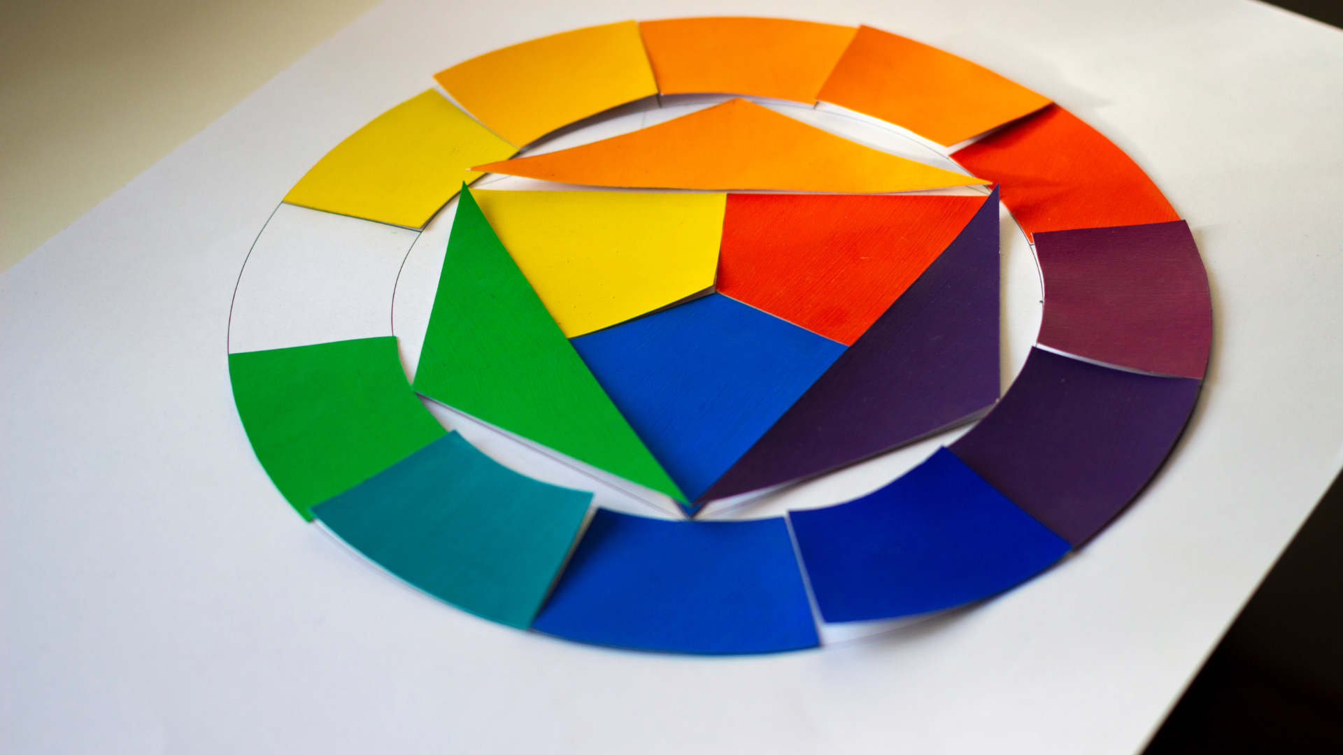
The Color Wheel that informs basic color theory
The color wheel is an important tool used in understanding colors. It’s a circular chart that displays the connections between different colors. There are three main colors, red, blue, and yellow, which cannot be produced by mixing any other colors. When you mix two primary colors, you can create secondary colors like green (by mixing blue and yellow), purple (by mixing blue and red), and orange (by mixing red and yellow). You can create tertiary colors by mixing a primary color with a secondary color.
- Color Scheme
The “color wheel” is a tool that’s frequently used in graphic design to help create pleasing combinations of colors called “color schemes.” There are various types of color schemes that designers commonly use.
- Monochromatic Color Scheme
The simplest color scheme is monochromatic, which involves using different shades of only one color. For instance, a monochromatic color scheme can have various shades of blue ranging from light blue to dark blue. This kind of color scheme is commonly utilized in minimalist designs to create a clean and unified appearance.
- Analogous Color Scheme
Analogous color schemes involve using colors that are next to each other on the color wheel, like blue and green or yellow and orange. This color scheme produces a pleasing and natural appearance because the colors are connected to one another.
- Complementary Color Scheme
Complementary color schemes use colors that are positioned opposite each other on the color wheel, like red and green or blue and orange. This color scheme creates an energetic and lively appearance, as the colors stand out against each other. Complementary color schemes are frequently utilized in striking and attention-grabbing designs, like ads or posters.
- Split-Complementary Color Scheme
A split-complementary color scheme involves using a main color along with two colors that are next to its opposite color. For instance, if you use blue as your main color, you can add yellow-orange and red-orange as the other two colors. This color scheme creates a striking and lively appearance, yet it still keeps a feeling of balance among the colors.
- Triadic Color Scheme
A triadic color scheme means using three colors that are evenly spread out on the color wheel. For example, red, yellow, and blue can be used together in this type of color scheme. This approach creates a lively and well-balanced appearance because the colors are equally spaced around the wheel. Triadic color schemes are usually employed in lively and cheerful designs, like children’s items or event posters.
- Color Psychology
Colors can stir up feelings and convey meanings. For instance, red is commonly linked to strong emotions like passion, excitement, and hazard, whereas blue is associated with serenity, reliability, and expertise. Knowing the psychological impact of colors can aid graphic designers in crafting designs that express the intended message.