

Times are changing, and so the people’s perspectives towards opting for colors; the vibrant colors will not go out of style in 2021, but there will be a greater emphasis on muted Muted Color Palette.
People have spent a sufficient amount of time staring at screens this year; that was the time of online courses and socially distant celebrations. Some hues are more pleasant to view than many others. Comfortable, easy-on-the-eyes colors will be popular in 2021.
Muted Colors
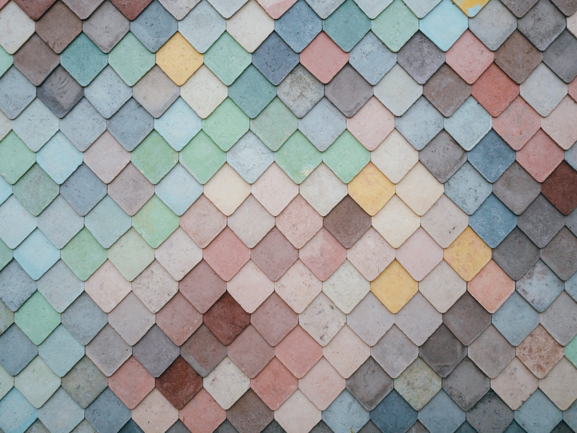
Muted colors are those that have a low saturation level. These were faint hues that have dimmed or greyed. On a foggy day, compare the colors in the sky to the shades in the air on a bright sunny day. When opposed to a sunny day, the color tones on a foggy day are often duller and muted.
Effectiveness of involving Muted Color Palette
Vibrant hues have a place in the world. However, using strong colors sparingly in the mix with muted shades is significantly more effective. Consider colors green, red and blue below, which were frame by a bright yellow. The hues compete for the viewer’s attention. This color combination may be undelightful to look upon.
Few Techniques to ponder upon
You can use a variety of hues, colors, and textures to create something unique. Likewise:
Tints
When you mix white with color to brighten it, you get them. This color is frequently much softer than the original color and was refer to as a pastel. Tints are popular on websites with artwork and work well with images. These lighter hues tend to deviated from the primary aesthetic and ideally used in design when additional content, like images or phrases, must take center stage.
Shades
They are colors that the introduction of black has enhanced. It makes the color appear darker to the sight. Shades can work effectively in some situations, especially when combined with less black. If not done effectively, designs that are extremely dark can cause problems regarding reading.
Tones
They made by blend blacks and whites with a hue to give it a soft appearance. Tones draw from several regions of the color spectrum. Tones are the most popular option of artists and designers for most projects because of their delicate quality.
The actual takeaway from the above discussion is this: Make a statement with a unique process to produce the pattern and usage on your own. Results can be delightful to change merely the color palette while continuing working on flat designs.